Product Design
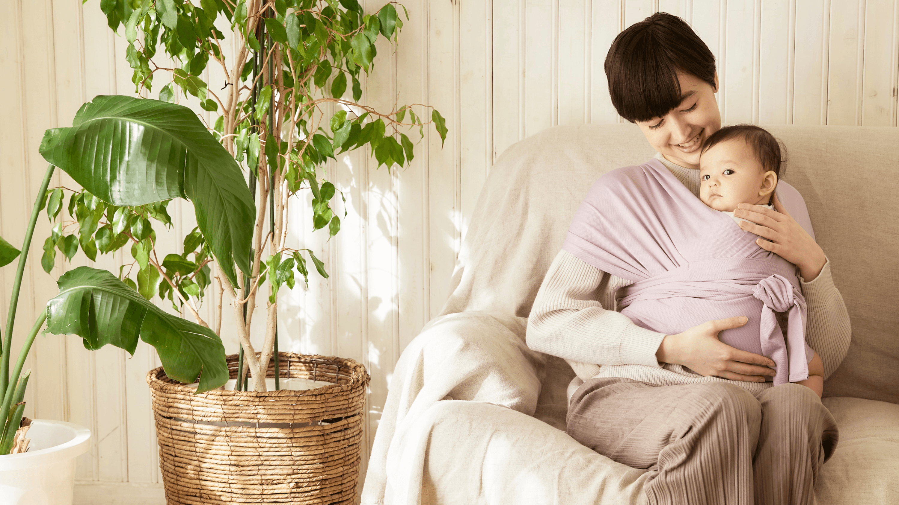
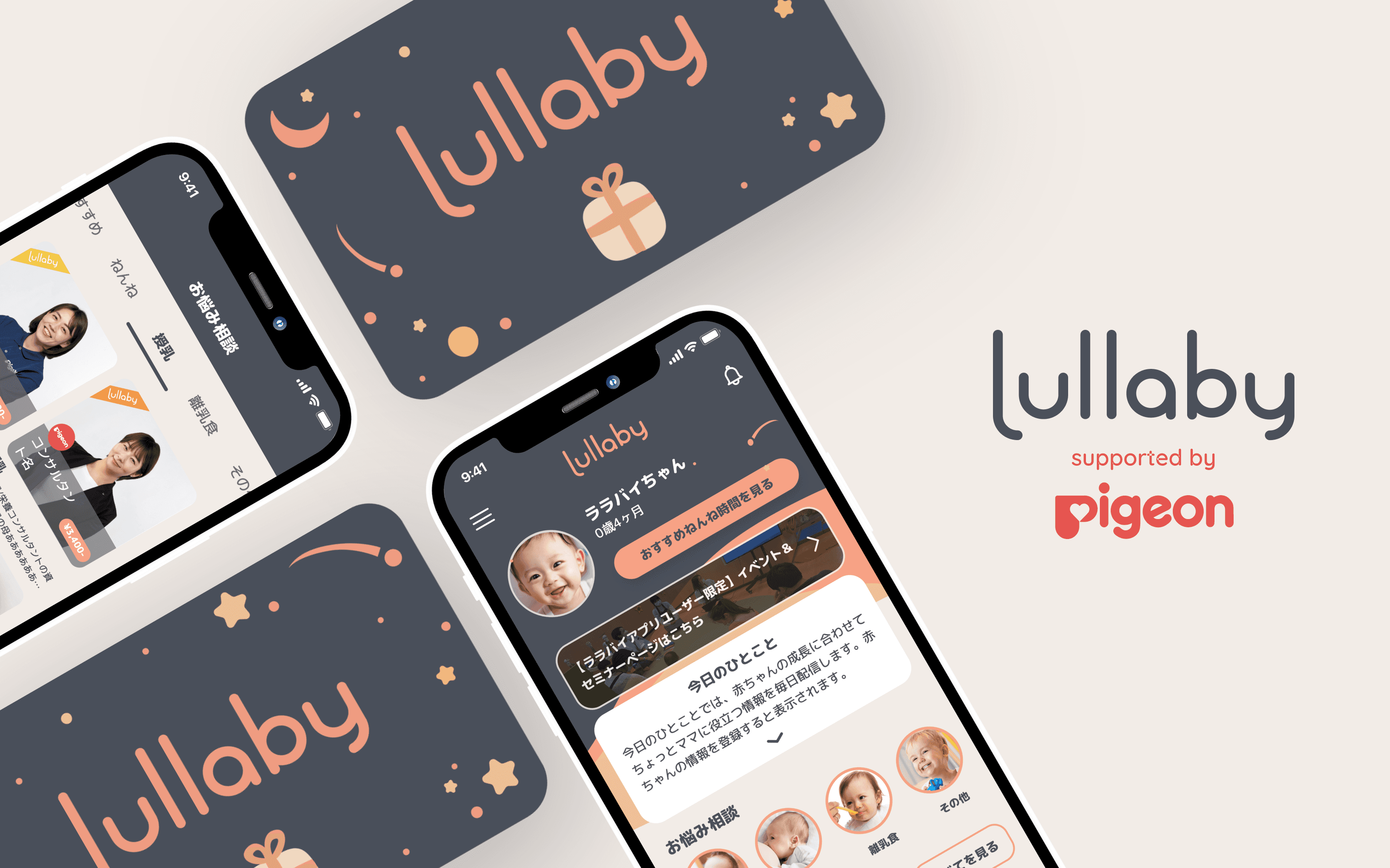
From April 2023, Lullaby has partnered with Pigeon - a leading household childcare product brand, to provide an even wider range of consultations and resources to parents. From feeding and diapering to playtime and beyond, the app is completely restructured to support new parents every step of the way.
Our main goals with the project were:
Optimizing before expanding: Conduct consultant interviews and tackle the app's existing user experience problems.
Creating new user flows that communicate Lullaby's new value proposition.
Client
Moon Creative Lab Inc.
Year
2023
Role
Product Designer
Identifying existing issues.
Before creating new user flows, we felt the need to address and solve the app's existing user experience problems. We conducted interviews with 7 consultants and were able to pinpoint a number of major flaws, below are the most prominent changes:
Optimizing empty spaces.
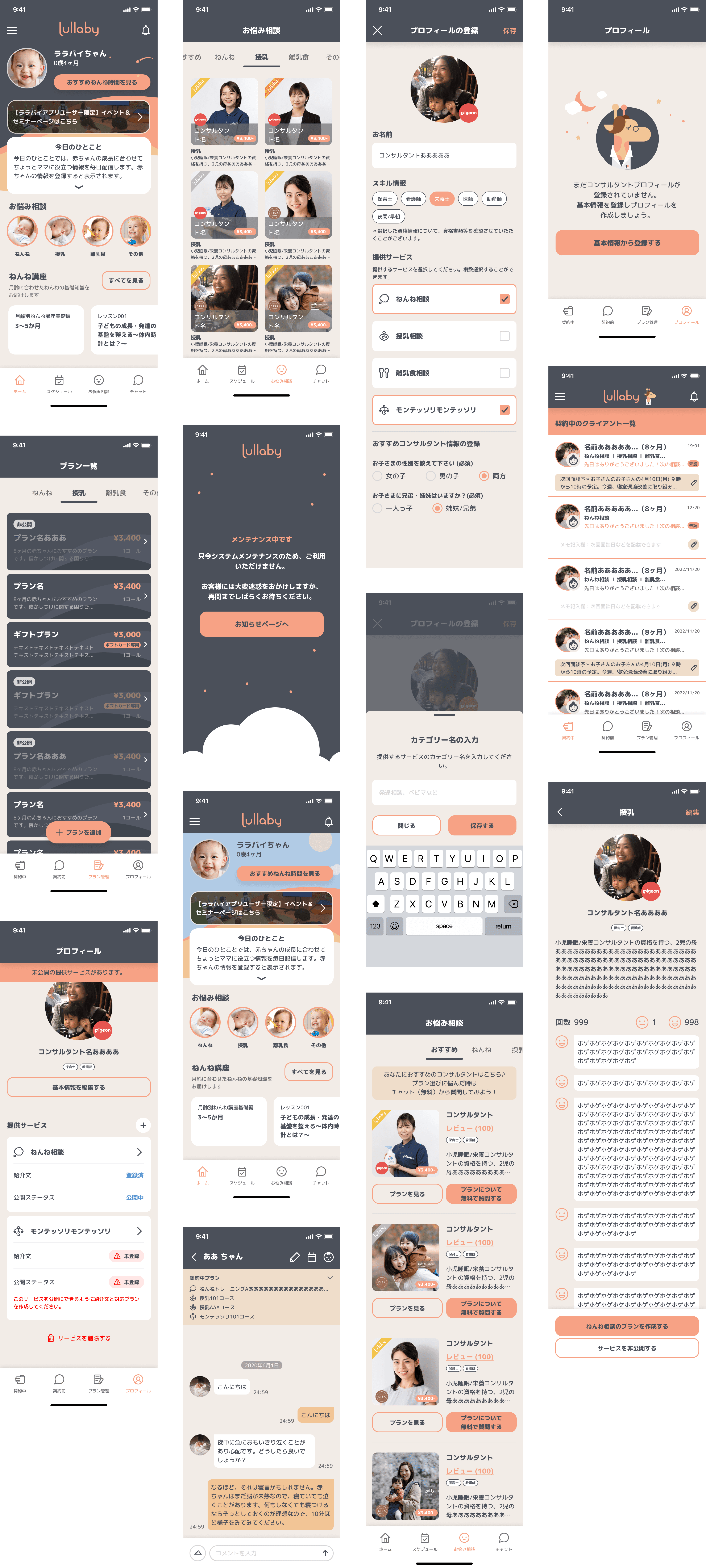
Most of the consultants interviewed felt the need for a quick memo/tag display on the Client Chat Screen that lets them keep track of ongoing contracts as well as past clients.
On the other hand, the old Client Chat screen had large unnecessary empty spaces but left no suitable room for a memo display.
The redesigned new chat UI takes inspiration from Line Chat, optimizing the space for more information and features while still ensuring an intuitive experience.
Highlight the key visuals.
The Home Screen had unnecessarily large spacings with a quite confusing visual hierarchy. If the new consulting categories area were to be added, the interface will look overwhelming with scattered focus. The sleep training course section will also disappear from the app's viewport.
The redesigned home screen features the new consulting category buttons with baby image backgrounds, chosen to draw attention first-hand when the user land on the home screen. I also removed unnecessary illustrations in the 今日のひとこと section that might take the focus away from the event and consultation areas. A new spacing guide was introduced to achieve better visual consistency throughout the app.
Redesigning for accessibility.
11 out of 17 consultants interviewed felt that the color scheme in the chat screen makes the texts hard to read. This is not friendly to parents with visual impairments, or cognitive disabilities, and definitely not suitable for mobile viewing.
The app also now allows parents to contract multiple plans with 1 consultant. This creates the need to display ongoing plan list somewhere on the conversation screen.
The redesigned screen introduces an easier-on-the-eye color scheme for the chat bubbles. At first, I created 3 new color combinations, which received direct feedback from the consultants, and the final one was also chosen based on their votes. The new screen also features an ongoing plans dropdown below the header to help consultants better keep track of their service.
Communicating Lullaby's new value proposition.
To ensure that both parents and consultants can easily navigate the new app structure, I collaborated closely with the development team and stakeholders, gathering feedback and making adjustments based on performance.
Increasing conversion rates through dedicated consultant profiles.
Consultants can create different profiles for each of the services they provide. They are also allowed 1 custom service besides Lullaby's 3 main categories. This creates a chance for differentiation as well as more diverse support for parents, ultimately helping with Lullaby's retention rates and conversion value.